@wakecarter
I think that the components that the infinite components should be red (for warning) and only the one(s) with a force end of routine should be blue. An infinite text component would therefore always be red but you could easily see which out of mouse and keyboard components can be used to end the trial.
I’m still not sure about flagging up all infinite components - I think I might give the wrong idea that infinite components are breaking it and not a normal part of many experiments. However, some visual indicator for components which can end the frame would be good, so I’ll look into that. Maybe the force end could be red and the others blue? So the red is more “this one is powerful” than “this one is wrong”. Otherwise can easily just use other colours! This is the colour scheme, that orange could be nice, particularly against blue:
Could also use the same colours but a different shade - I have darker/lighter variants of each colour here made by a uniform ±15 to each RGB value.
@jonathan.kominsky
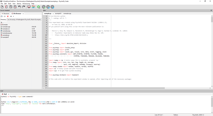
I’m thrilled to see a file browser in the new coder interface.
I’d love to take credit but that was in the Master branch before I did anything! The structure browser is in progress but the bare bones are there I believe.
@Michael
- The “stop task” button needs to show a proper cross symbol, rather than a capital X. It currently has clear serifs, which can give the impression that it has something to do with text rather than being a “stop” symbol.
- The “debug” symbol is quite hard to make out. For clarity, could it just be a positive bug image, rather than a negative one embedded within a blue circle? That would allow it to be slightly larger and more legible (the triangle “play” symbol works well as it is, because it is much simpler).
Both good shouts, I put the debugger in a circle partially for uniformity with the Run button, partially for visibility. I think I can simplify it though - make the legs further apart and thicker so they’re more visible at 16px. I may try spriting it at 16px and then tracing as a vector, rather than the other way around.
@Michael
I wonder if it would be possible to provide a simple small text label under each icon?
I really like this idea! wxButton does have some functionality for labels I think so I’ll have a play with that today - the only worry is being too visually crowded, but we’ll have to see how it looks.
@Michael
We could probably also take the opportunity to avoid some of the current duplication - e.g. the slider, rating scale, form, and brush all clearly belong under the “Responses” section, but probably just for historical reasons we also have them under “custom”, which is a bit confusing as to what the purpose of that section is. And maybe the syringes also belong under either “stimuli” or (maybe better) “IO”?
Fully agree, yes! Custom does make more sense as Code and Variable, the others make more sense in just responses / IO.


