I used 512x512 pixels which is the original image size. On my screen .5x.5 height would be 540x540.
The question is whether the poor resolution is due to resizing on the fly or the units used. If pixels set to a different value (not 512x512) works better than height then you could set this on the fly using the following:
imageDimension = int(win.size[1] * 0.5)
and then set the size to (imageDimension,imageDimension) “Each Repeat” in pixels
I would set the imageDimension in the End Routine of the first routine. The value is wrong in Begin Experiment because it gets set before the experiment hits Full Screen.
This definitely still seems to be an issue. It doesn’t appear to make a difference whether using pix or height, however I’ve noticed that the zoom settings in chrome (e.g., zooming out to 50%, 33% etc.) sharpen the image while maintating the size if set to height.
I’ve run a few tests on this on my laptop with a 4k monitor. It looks like there’s a mismatch between the window height/resolution in the browser versus the actual screen resolution, hence zooming out (50% zoom makes the screen height go from 1080 to 2160) sharpens the image:
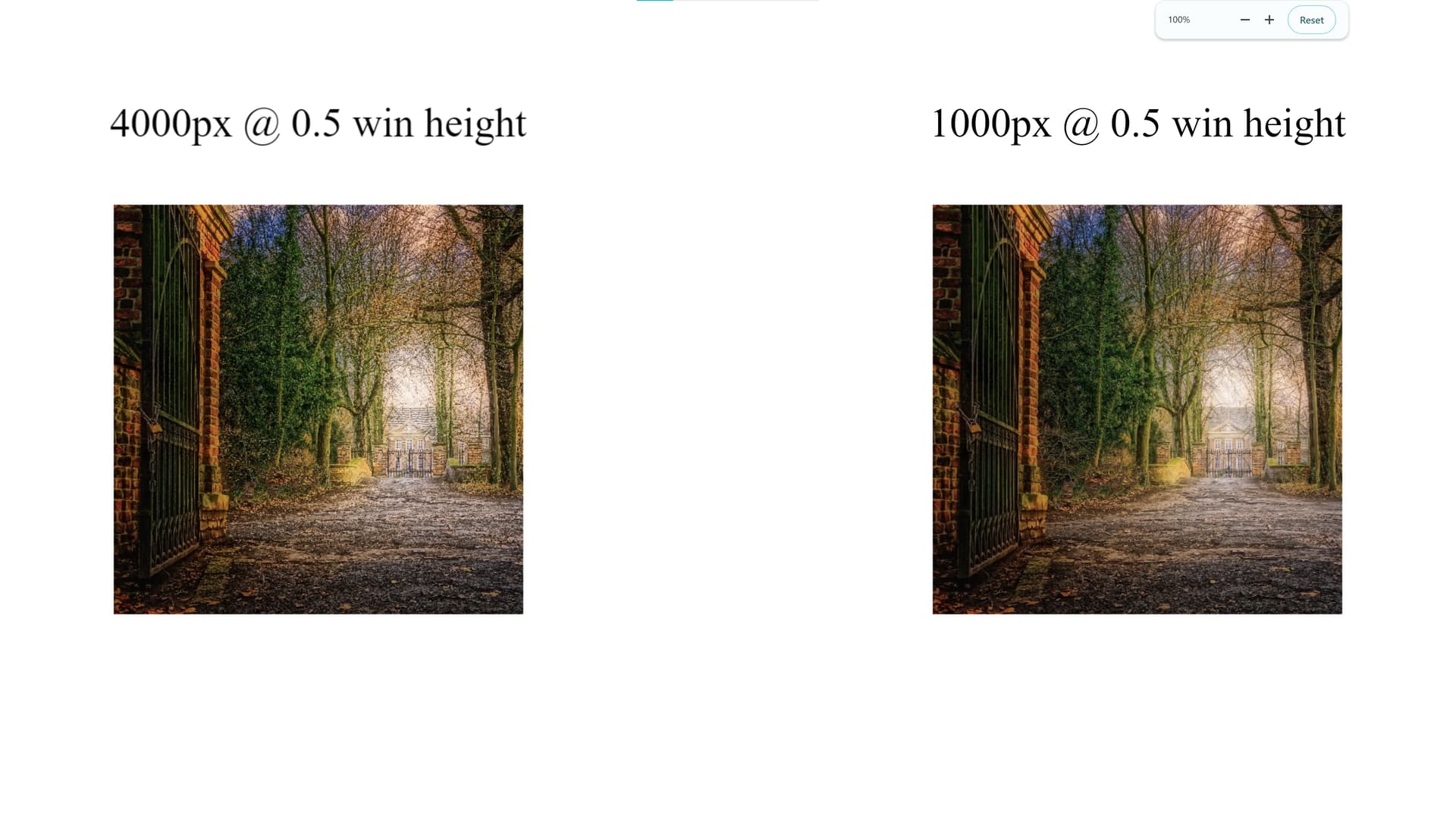
100% zoom, left = text component and image set to height units. Right = Texbox component and image set to win.size[1]*0.5 pixels:
I tested again with only height units and different original resolutions, left = 4000pix, right = 1000pix. So it seems the resizing/interpolation causes changes. However again when zooming out to 50% where the screen height matches the monitor resolution, the differences appear to be minimised/resolved:
Not sure how feasible/realistic it would be to set everything in height units then have participants adjust their zoom settings based on their monitor resolution (e.g., 50% for 4k, 66% for 1440p)?
A bit of further context to the above, it seems in my case the culprit is windows scaling settings. On my 4k monitor these are set to 200% which causes psychopy to run at 1080p in browser, hence zooming out by 50% correcting it. If I set scaling settings to 100% the experiment runs at the full 4k
Description of the problem: The images and text in our experiment are perfectly clear when it is run locally; however, when it is run online, even the text becomes blurry, looking like someone has screenshotted the experiment and made it less high definition. Right now, the only fix we have is if you turn the browser zoom from 100% to 50%, everything becomes high definition again like when run locally (see images below). However, is there a fix we can put in the experiment settings/code to avoid participants having to change their browser zoom?
I am facing the very same issue. Manually changing the browser zoom or the monitor zoom setting is the only fix I am aware of, but - at least in my case - it’s not something I can or would ask online participants to do. Any way to set it automatically?
We are crowdsourcing participants via Prolific, and so {cannot / do not want to} tell participants to manually adjust their browser zoom, either. Any suggestions on an automatic fix for this problem would be much appreciated!
Hi, I have the same problem both with texts and images. Since, in my experiment participants have to recognize objects, it is not ideal…I can ask them to manually resize the browser zoom but it would be better to have a control over this.Plus I need full screen mode and it seems that in this, the size pop back to 100%.
Any updates on this?? I’m working on an online experiment that should be iPad compatible and participants need to recognise elements of images which are incredibly hard to recognise because of this.
Use the proper resolution for your stimuli if you know the device your participants are using. So, load an image depending on the screen resolution and the device. This implies that you have images of different resolutions.
The problem is, I don’t know the resolution of the device participants will be using. This is an online experiment that should be compatible with both tablets and computers. Furthermore, my experiment has a LOT of stimuli images, so I cannot include duplicate images of different resolutions.
No renderer tweak fixes blurry source images. If the source image has fewer physical pixels than display area × devicePixelRatio, it gets upscaled and blurred. Rule of thumb: prepare images at stimulus_size_in_height_units × screen_height_px × max_expected_devicePixelRatio (assume dPR up to 2–3 across a mixed desktop/tablet/phone sample). Downscales are usually clear, so oversizing is cheap; undersizing is not recoverable. Practical fix: bump up your source image resolution once, keep the Image component’s size in height units (not pix) so it stays consistent across devices. Notice that this might affect loading stimuli, so do not make the images much larger than needed. Use an image editor to get the proper resolution.
THE OS-level display scaling (Windows 125%/150% etc.) distorts the CSS-pixel↔physical-pixel relationship on top of devicePixelRatio, and it’s not reliably detectable or correctable from the browser. Realistically this needs to be handled by instructing participants (browser zoom at 100%, avoid extreme display scaling) and using
@JensBoelte Here’s my Github issue so you can see the image quality yourself:
My source images have a resolution of 1300x1300 and their size on the display should be 0.3x0.3 (height units). The problem is that they are being scaled down according to the logical resolution, and the dPR isn’t considered. This is all with a zoom of 100%.
So assuming a newer iPad is being used with a logical resolution height of 1366, a dPR of 2 and height in units of 0.3 → 820 pixels which is less than my source image resolution.
THE OS-level display scaling (Windows 125%/150% etc.) distorts the CSS-pixel↔physical-pixel relationship on top of devicePixelRatio,
From what I can see, the OS-level display scaling IS the devicePixelRatio. At least when I modify it on my computer, you can see the devicePixelRatio updating on a website like Screen Resolution Detector | Wootils
I’m sorry but I did not understand the question regarding the standard start-dialog. What do you mean by this?
Ah, you are referring to the info dialog! Yes, the window is set to full screen after the info dialog, which unfortunately does not help with the scaling issue
Hello @lua
Good catch, and one correction on my end.
Regarding OS scaling/devicePixelRatio, you’re right; I overstated that. In the latest versions of the major browsers, OS-level display scaling is already incorporated into devicePixelRatio — your test confirms this. Sorry for the imprecise phrasing.
On the resolution issue itself: worth checking directly on the affected iPad whether the renderer is actually configured the way it should be:
If view.width ≈ parseInt(view.style.width) × devicePixelRatio, the renderer itself is configured correctly and the issue sits above it (browser compositing/viewport handling). If not, it’s a renderer-config problem worth digging into further.
Can also confirm similarly predictable values on my computer and other devices.
So it’s not a renderer issue, which makes sense because I have not been able to find anyone using Pixi JS recently. Worth noting that this isn’t just an iPad issue, I’m having the same issue on other devices with devicePixelRatio > 1, albeit smaller on my laptop because my dPR is 1.33
As others have reported: if I zoom out on the iPad, or any device using a high dPR for that matter, the image rendering quality increases to the level of quality you would expect on a physical resolution of that screen. That is when the view.style.width and .height is equal to the physical resolution of my device.
I thought I could try doubling the overall PIXI resolution in the Window.js of the PsychoJS source code to see if the images are then scaled nicer but the quality stays the same.
// Begin Routine of the first routine
if (psychoJS.window._renderer.resolution !== 1) {
  psychoJS.window._renderer.resolution = 1;
  psychoJS.window._renderer.resize(psychoJS.window._size[0], psychoJS.window._size[1]);
}
or
// Before Experiment
if (window.devicePixelRatio > 1) {
  Object.defineProperty(window, 'devicePixelRatio', { value: 1, configurable: true });
}